Displaying KPIs
This chapter describes how to display a KPI value in a chart and how to display a list of all KPIs included in CrystalBridge® Monitoring. For more information, see the chapters Displaying a KPI in a Chart and Displaying a List of All KPIs.
Each KPI has a context menu available with additional functions for the KPI. For more information about the KPI tree and its context menu, see the chapter KPI Tree and Context Menu.
For information about how to display several KPIs in one chart, see the chapter Displaying Several KPIs in the KPI Mix Chart.
Prerequisites
Systems and servers are only displayed if you have already added them to CrystalBridge® Monitoring. For more information about adding systems, see the chapter Adding a New System.
Displaying a KPI in a Chart
Proceed as follows to display a KPI in a chart:
-
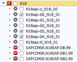
Under System landscape, select a particular system and a server.
-
Specify a time interval.
The default and custom KPIs are displayed on the left-hand side under KPI groups. KPIs and KPI groups can have an active or inactive (gray) status.
-
Active KPIs: These KPIs are monitored for the selected systems and servers in the selected time interval.
-
Inactive KPIs: These KPIs are not monitored for the selected systems and servers in the selected time interval. The inactive KPIs are not displayed in KPI charts.
For more information about how to start the monitoring of a KPI in a specific time interval, see the chapter Scheduling the Monitoring of KPIs.
NOTE If the inactive KPIs are not visible in KPI groups, you can display them by clicking Settings > User settings in the menu bar and deselecting the options Hide unused KPI from KPI groups and Hide unused KPI groups. For more information about user settings, see the chapter Adjusting the User Display Settings.
-
-
Select a KPI under KPI groups.
-
Go to the KPI charts tab.
-
Search for the KPI. To do so, you have two options:
-
Enter a keyword or a technical name of a KPI into the search field. The search field is located just above the KPI groups area.
-
Filter the KPI by selecting Filter and entering its technical name.
-
KPI Charts
For more detailed information about KPI charts, see the chapter KPI Chart Description.
Limits for Displaying Data
If the amount of data reaches its limits, the charts are not refreshed and a pop-up appears, informing you that the chart rendering has been frozen:
-
If you click Less data, the system refreshes the screen and displays only one KPI chart as a 1x1 grid for the selected systems and time period.
-
If you click Same data, the system tries to refresh the screen with the existing selection. If the refresh with the same data makes the screen freeze again, then the pop-up is displayed again.
Displaying a List of All KPIs
There are two options for displaying a list of all default and custom KPIs:
-
The first option is to display KPIs on the main screen under KPI groups. In this view, it is not possible to edit custom KPIs and to distinguish between a custom and default KPI.
-
The second option is to use the second view. This allows you to distinguish the custom KPIs from the default KPIs, because the technical name of a custom KPI starts with a capital Y* or Z*. In addition, you can edit the settings of custom KPIs. To display this list, start transaction /DVD/MON_CUST and double-click KPI definitions.
KPI Chart Description
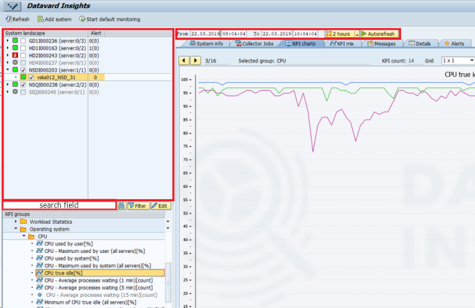
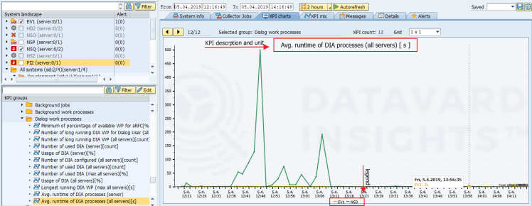
Each chart describes the behavior of a monitored KPI based on the time interval and the systems and servers that you selected under System landscape.
This chapter describes KPI charts and explains what information you can find in a chart. For more information about displaying KPIs, see the chapter Displaying KPIs.
KPI charts are structured as follows:
-
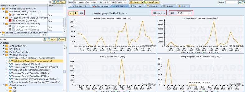
The KPI description is displayed at top of the chart. The unit of the KPI is displayed after this KPI description in square brackets.
-
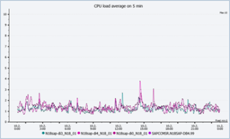
The X-axis represents the timeline, and the Y-axis represents the measured values.
-
A legend is displayed at the bottom of the chart and shows the selected systems or servers of the KPI series. You can click the system or server name in the legend to hide or display the KPI series for the particular system or server.
NOTE If you do not see the legend in a chart, check the display settings for legends. To display the legend, click Settings > User settings in the menu bar. Then click Charts and select the option Display legend in charts.
-
The measured KPI is displayed according to the number of systems or servers that you have selected under System landscape:
- If you have selected one system or server, the KPI is displayed as a single line or series.
If you have selected more than one system or server, the KPI is displayed as several colored lines. These lines represent the individual systems or servers and are known as a colored series. In the legend, you can view which colored series is associated with which system or server.
You can choose the number of KPIs that are displayed in separate charts per page:
-
The following options are available in the Grid layout: 1x1, 1x2, 2x2, 3x3 and 4x4.
-
The number of KPIs belonging to one group is displayed in the KPI count field. In our example, there are nine KPIs.
-
You can switch between pages using the arrow buttons in the top left-hand corner of the KPI charts tab.
Several KPIs displayed on one page
Displaying Several KPIs in the KPI Mix Chart
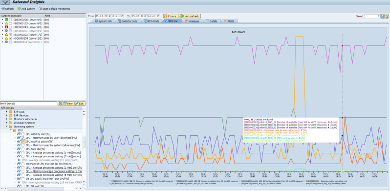
In the KPI mix tab, you can see the behavior of multiple KPIs together in one chart. You can graphically compare dependencies between different KPI values for the selected time period.
In addition, you can display KPIs that correlate with the source KPI, as described in the chapter Finding Correlated KPIs.
For more information about how to display one KPI value in a chart and about general settings that are necessary to display a KPI, see the chapter Displaying KPIs.
Proceed as follows to display a KPI series in a chart:
-
Under System landscape, select systems or servers.
-
Specify a time interval.
-
Select KPIs in the KPI groups tree.
You can only select active KPIs that include a checkbox. Inactive KPIs cannot be selected because their values were not collected for the specified time period or the selected system.
You can also use the Select all or Deselect all option by right-clicking a folder node in the KPI groups tree.
The selected KPI is displayed as a new colored KPI series in a chart.
Finding Correlated KPIs
The KPI mix tab is mainly used for finding and displaying KPIs that correlate with the source KPI. The correlation function calculates the correlation coefficients for all KPIs that have the same collection period, for example 5 minutes, and have at least two collected values in the specified time period. Correlation coefficients contain values from the interval -1 to 1. The closer the absolute value of the coefficient is to 1, the more the KPI correlates with the source KPI.
By default, only the first 20 KPIs that have a coefficient greater than 0.7 are displayed.
If the system does not find any correlating KPI, only the selected KPI is displayed in the KPI mix chart.
Proceed as follows to find correlated KPIs:
-
In the context menu, right-click any active KPI under KPI groups and select the option Find correlated KPI(s).
The submenu includes systems or servers based on your selection under System landscape. The content of the submenu depends on whether the selected KPI is defined as a system or server KPI.
-
Select one system or server.
-
The correlation function is executed. The list of all correlating KPIs that were found is displayed in the KPI mix chart.
