BW System Health
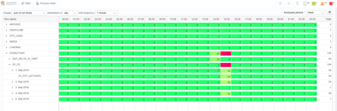
Runtimes and Errors in Process Chain Steps
This visualization displays runtime and error statistics for process chain steps that were running on a system in the selected time range. This analysis enables you to check all active process chains at once on a particular system.
You can change the view by selecting day or week in the distribution in drop-down menu. You can also filter the results according to the displayed characteristics. The basic view displays results in four levels:
|
Level |
Level description |
|---|---|
|
1 |
Type of process chain step |
|
2 |
Name of the process chain |
|
3 |
Date of the result |
|
4 |
Variant used for the process chain step |
Result KPI Types
In the Display drop-down menu, you can select a sum or an average of the KPIs runtimes and the number of errors. Note that an average is only possible for values above 0.
Distribution
You can distribute and aggregate the results into a day view or a week view.
In the day view, the results are displayed in hours and in the week view in days.
Runtime Value Calculation
The value of a runtime depends on the selected sampling frequency, distribution and selected time range. The value of a runtime displays the number of frequency intervals of a process chain step that were running in the selected time range.
Example: A process chain step was running from 10:45 to 12:50 and has settings as shown in the table below.
By distributing this process chain step in a day view, three time intervals that intersect with the day view distribution are obtained.
|
Interval from (day view) |
Interval to (day view) |
Process chain step from |
Process chain step to |
Results in a different frequency |
|
|---|---|---|---|---|---|
|
1 minute |
5 minutes |
||||
|
10:00 |
11:00 |
10:45 |
11:00 |
15 |
3 |
|
11:00 |
12:00 |
11:00 |
12:00 |
60 |
12 |
|
12:00 |
13:00 |
12:00 |
12:50 |
50 |
10 |
By changing the sampling frequency, for example to 1 minute or 5 minutes, you can obtain more or less detailed results.
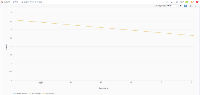
Query Runtime
These visualizations show query average runtimes within the analyzed period. There are two charts. The left-hand chart displays query groups based on the average runtime, i.e. how many queries in the system belong to each performance group during the analyzed period. The right-hand chart displays a scatter chart plot for each individual query showing the average runtime and the number of executions.
You can filter the data and switch to the table view for more detailed information as well as to download the data in CSV format for further processing.
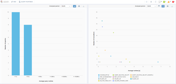
You can click the left-hand column in the chart to obtain more information about the query execution.
It is also possible to filter or download data. You can also click the row in order to obtain more information about the query execution, for example the time when the query was executed; the minimum, maximum and average query runtimes; and the selection string.
You can also access this analysis directly from the scatter plot in the query runtime analysis by drilling down on the data in the scatter plot.
You can filter the data and switch to the table view for more detailed information as well as to download the data in CSV format for further processing.
Query Runtime by Categories
The visualizations show query average runtimes according to query processing categories within the analyzed period. The following categories are displayed:
-
BI Suite
-
Data Manager
-
OLAP – Cache
-
OLAP – OLA
-
OLAP – Authorizations
-
OLAP – Input help (for more information, see the SAP documentation)
The upper part of the analysis displays the average time spent in processing by each category for an entire system. The lower part displays the average processing times in categories for individual queries.
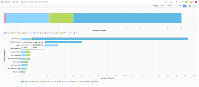
You can filter the data and switch to the table view for more detailed information as well as to download the data in CSV format for further processing.
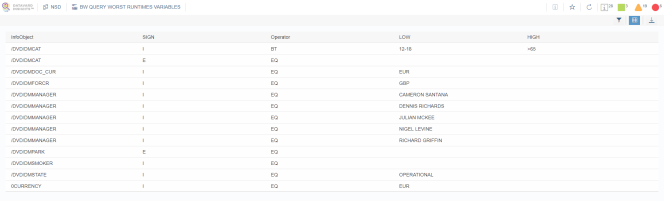
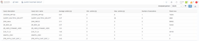
Best and Worst Query Runtimes
This visualization shows the worst and the best query execution runtimes within the analyzed period per day. For each day, a maximum of 10 worst query executions are captured.
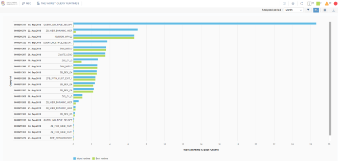
You can filter the data and switch to the table view for more detailed information as well as to download the data in CSV format for further processing.
You can click the data in the chart area or in the table to view the exact selection of the query for the corresponding execution. Here, you can also filter the data and downloaded it in CSV format.